
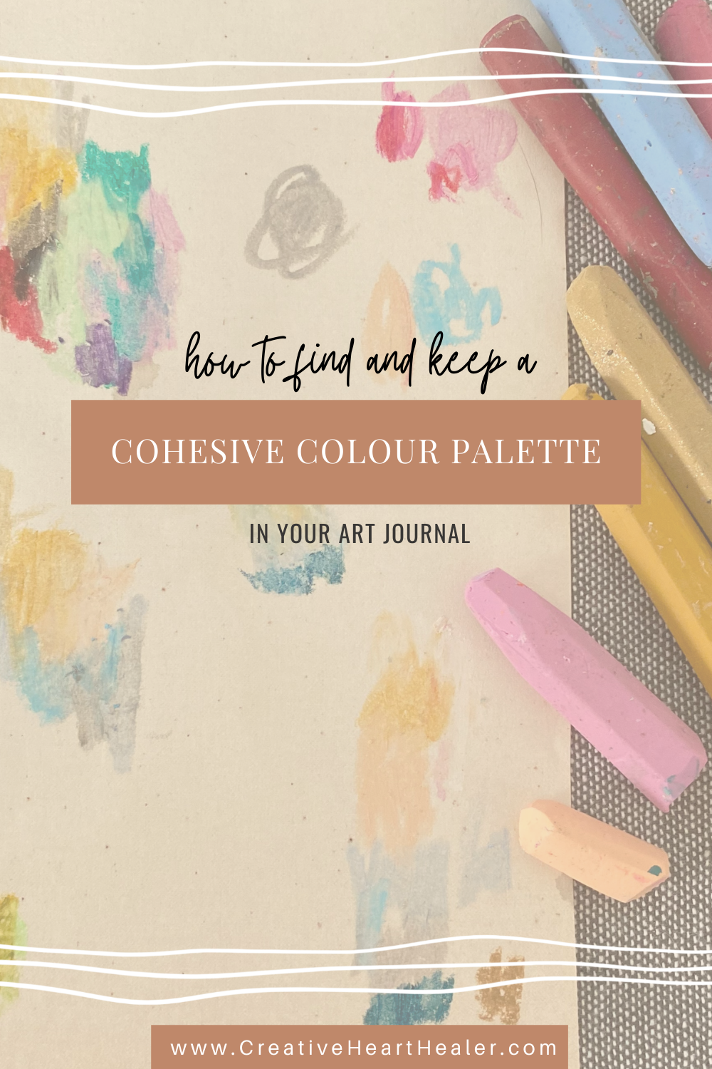
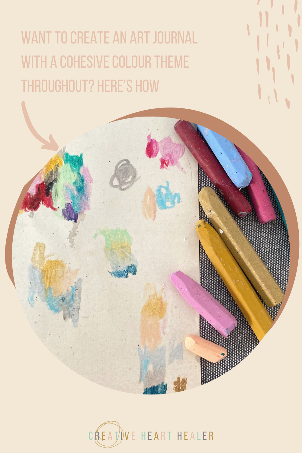
HOW TO FIND AND KEEP A COHESIVE COLOUR PALETTE IN YOUR ART JOURNAL

Want to use colour in a more sophisticated and consistent way in your art journals?
This is how to make the colours in your art journal work together and flow from start to finish.
I get asked often about my use of colour, mostly about how I come up with such dreamy colour palettes for my journals and how I keep to a consistent colour theme within its pages. I thought I’d share a quick step by step in this blog post showing you where I get my colour inspiration from and how I choose the right colours from all my art materials.
I decided to compile my favourite colour palettes from my own little colour library journal for you to use as inspiration. Fill in your detail below and I’ll send them right to your inbox for instant viewing, saving, printing and creating!
steal my favourite colour palettes for free
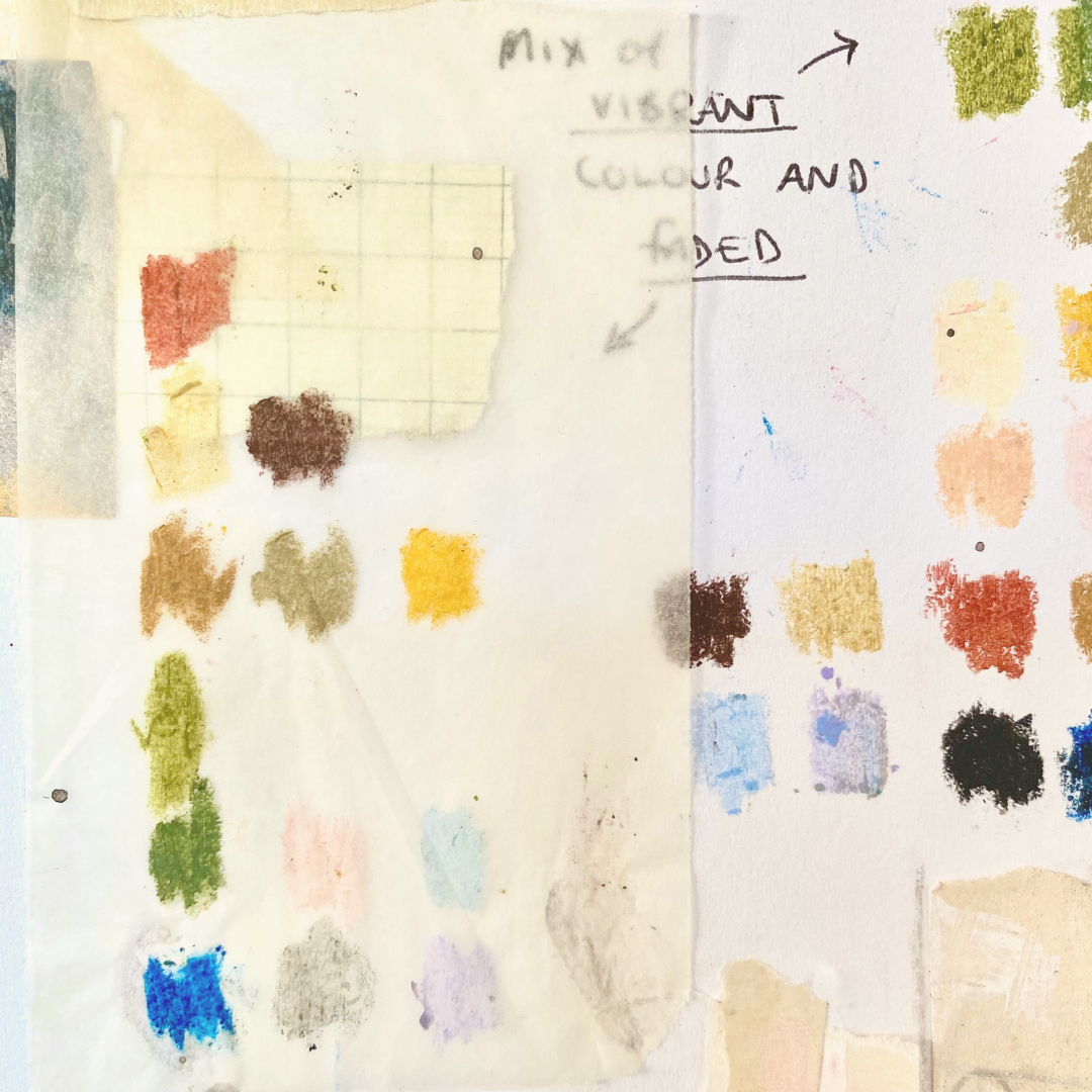

The key to a strong colour theme is to keep to around 5-7 colours and have 2-3 main colours and the rest as base colours. Anything more than this and there is just too much going on and your colour palette will lose its impact.
I do sometimes choose colours intuitively but that can be hard as a beginner and a good place to start is to look for the colour themes all around you. You could take inspiration from nature (flowers, leaves, shells etc), magazines, famous works of art, photography, an item of clothing, or simply putting the term colour palette into Pinterest will give you thousands of swatches for inspiration.
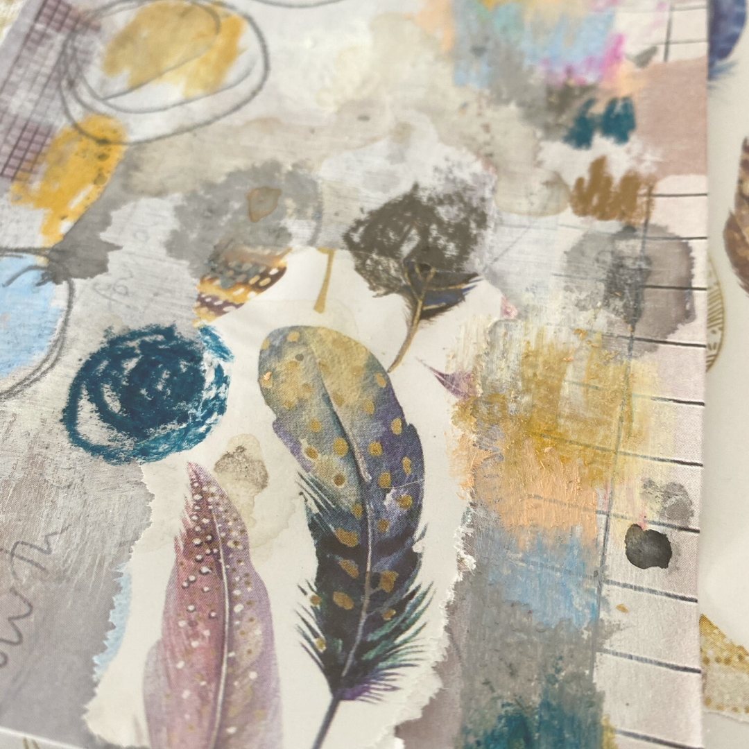
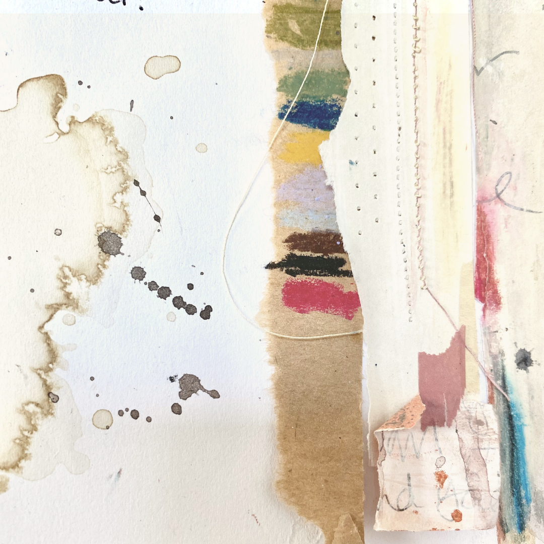
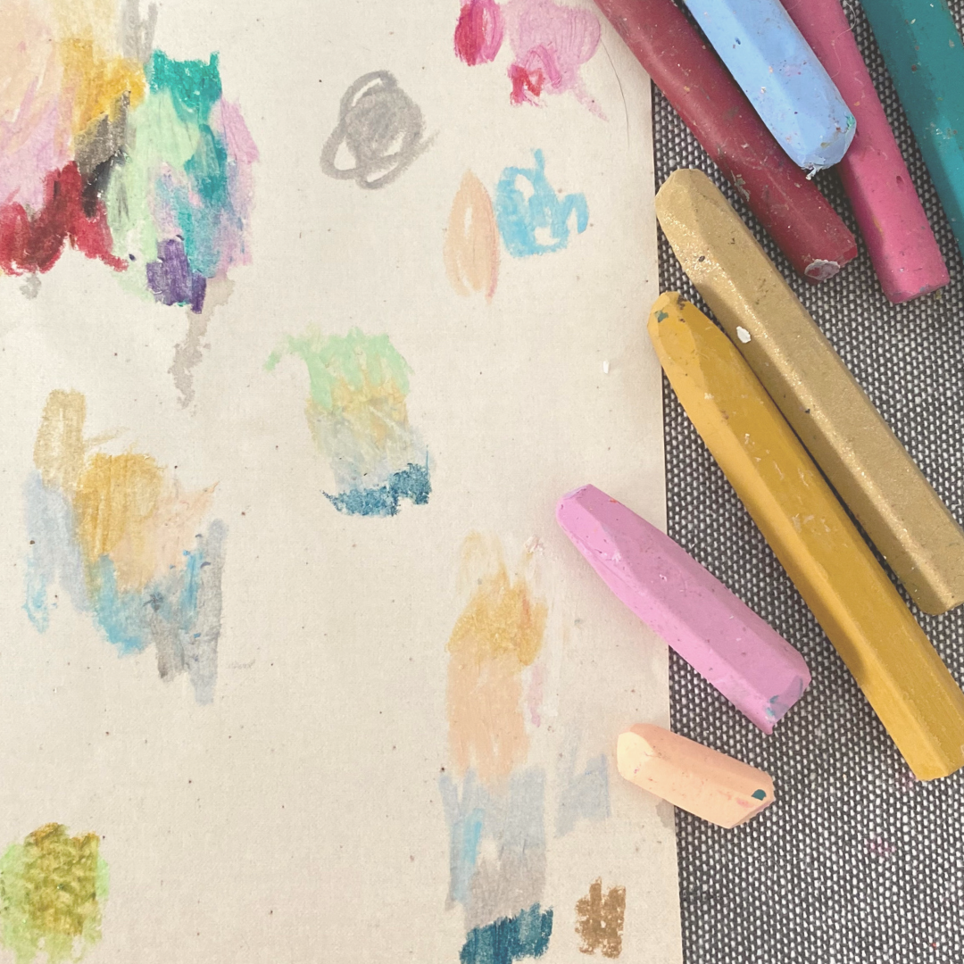
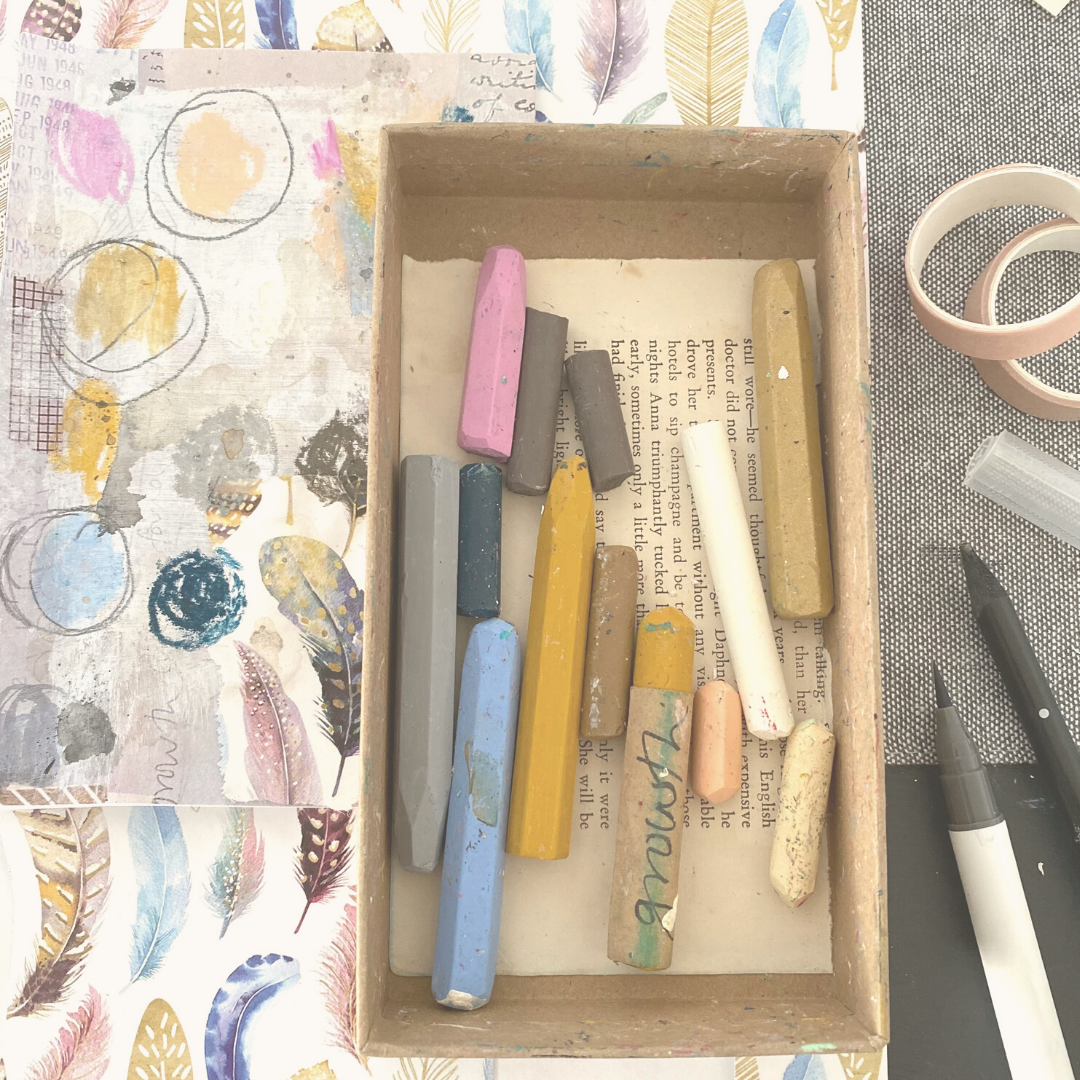
Once you have your inspiration piece (mine below is a sheet of wrapping paper) it’s time to pull out your art supplies and a scrap piece of paper.
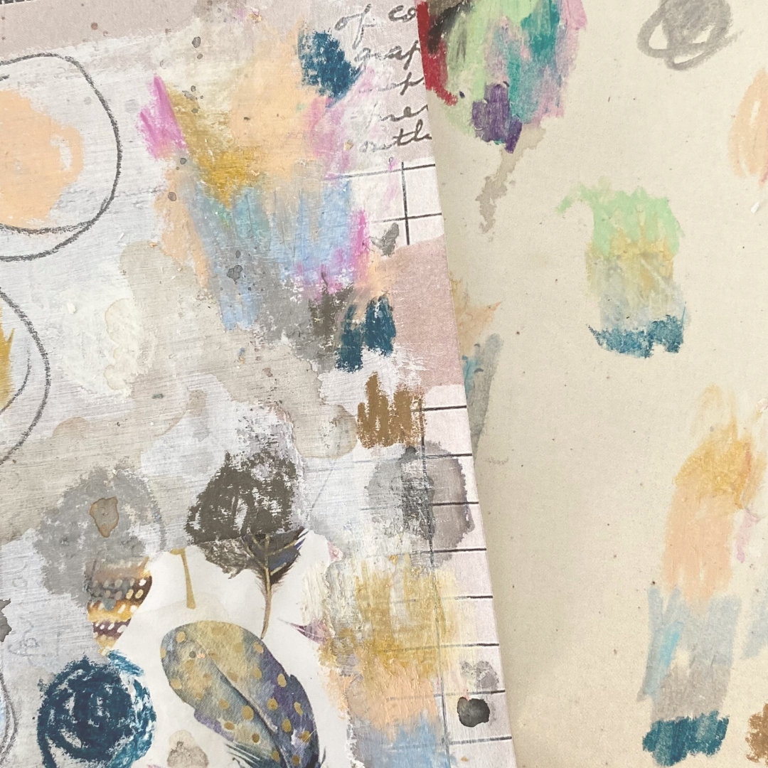
Begin picking out the pencils/pastels/paints that are close to what you see in your inspiration piece and start scribbling or painting little swatches in your scrap paper. Experiment with placing different colours side by side, tones and shades of the same colour, and with proportions of each colour.
This is a complete experimentation stage, it might take a few goes to choose the right coloured pencil or mix the right amounts of paint, but just get everything down on this scrap paper (you might also want to make little notes about how you mixed a particular paint colour)
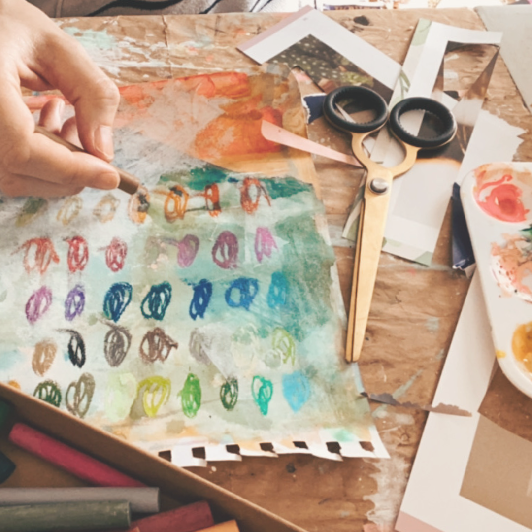
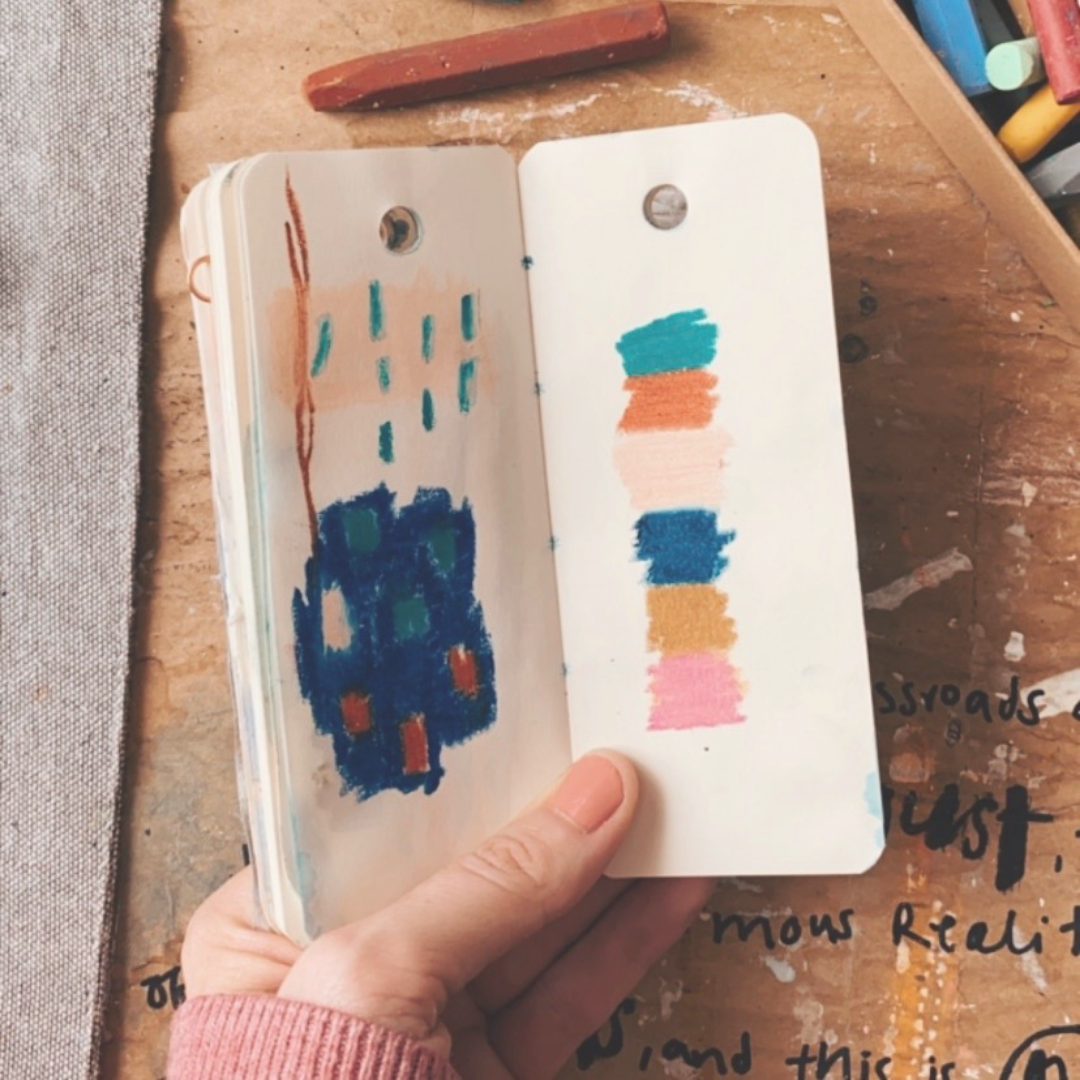
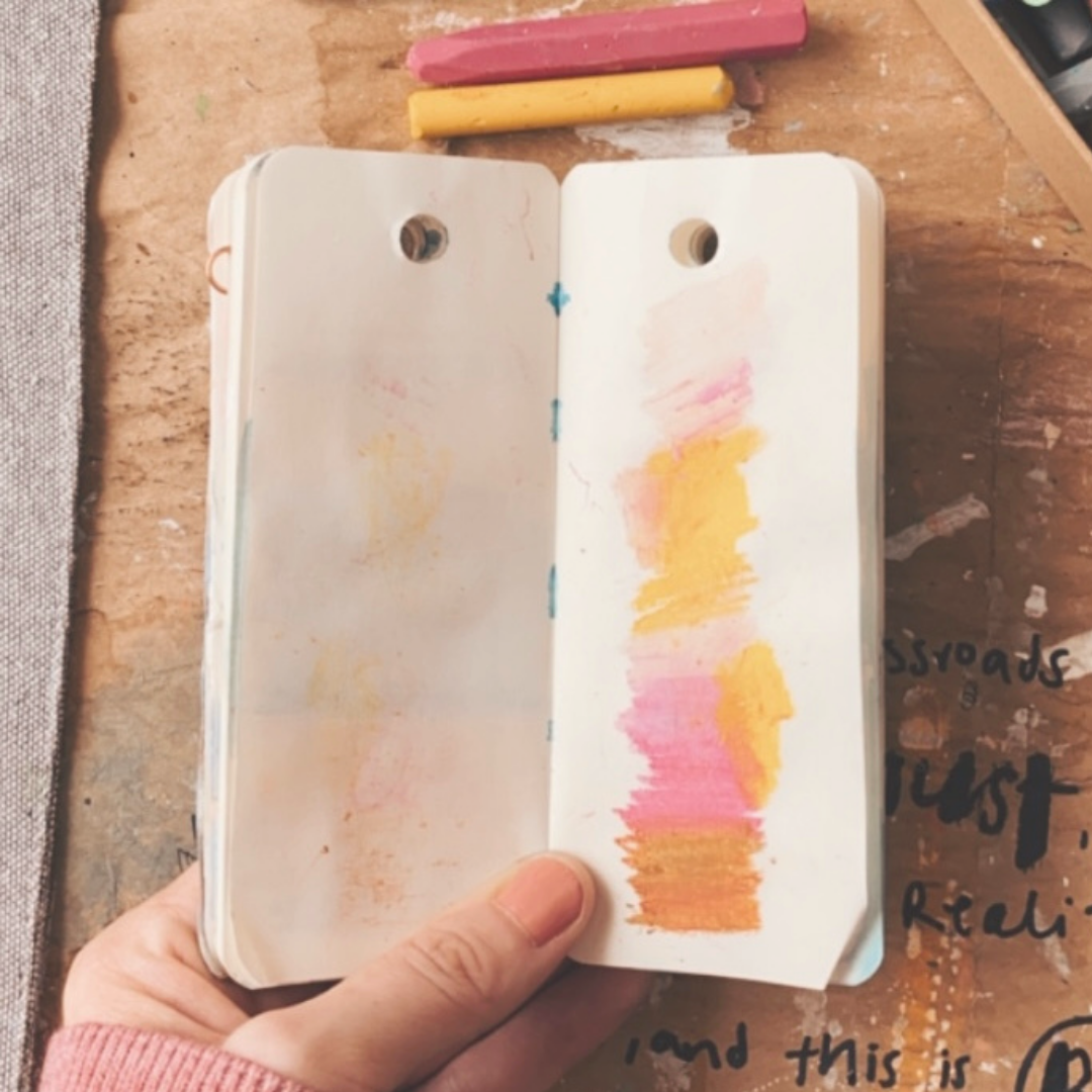
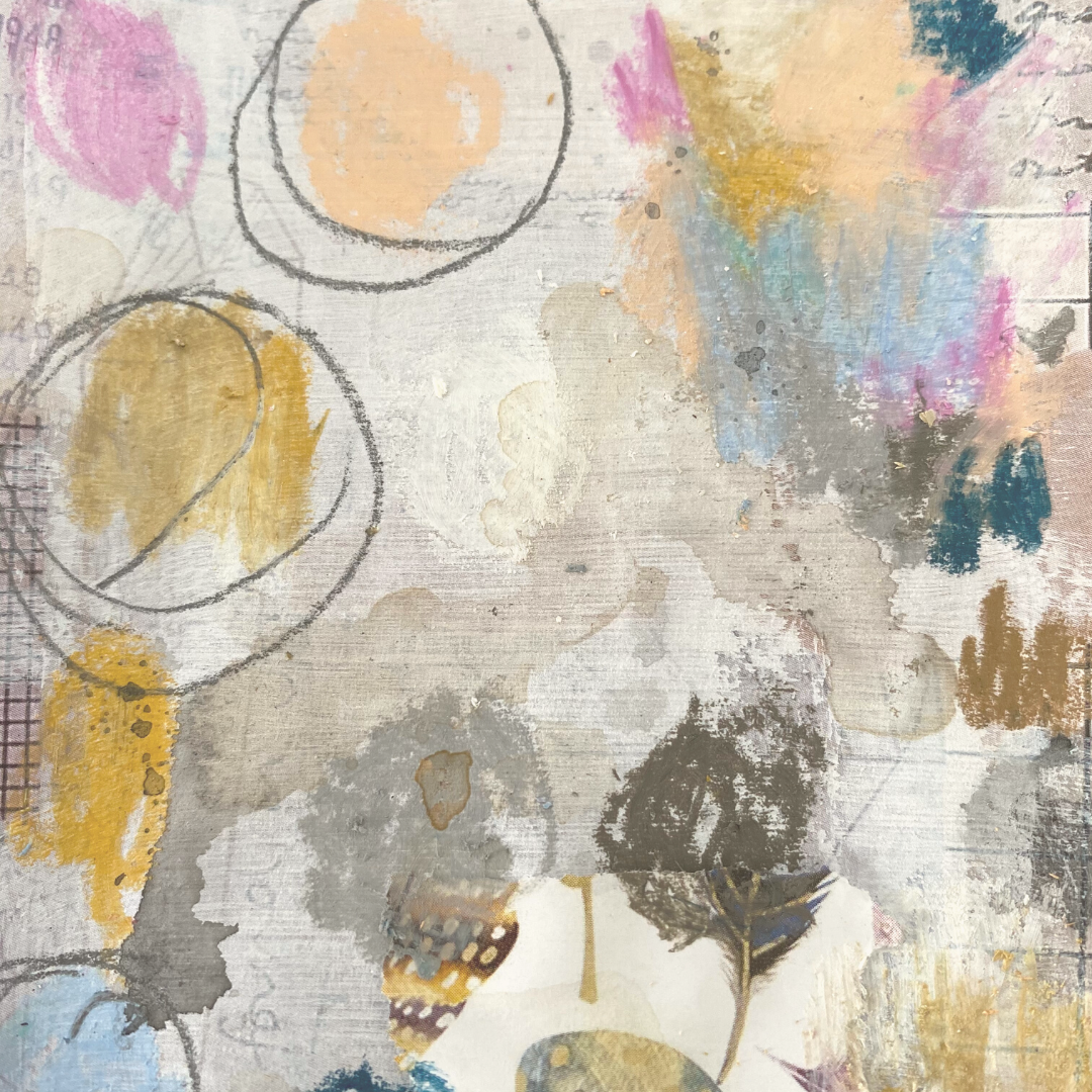
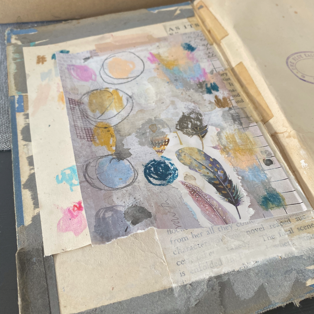
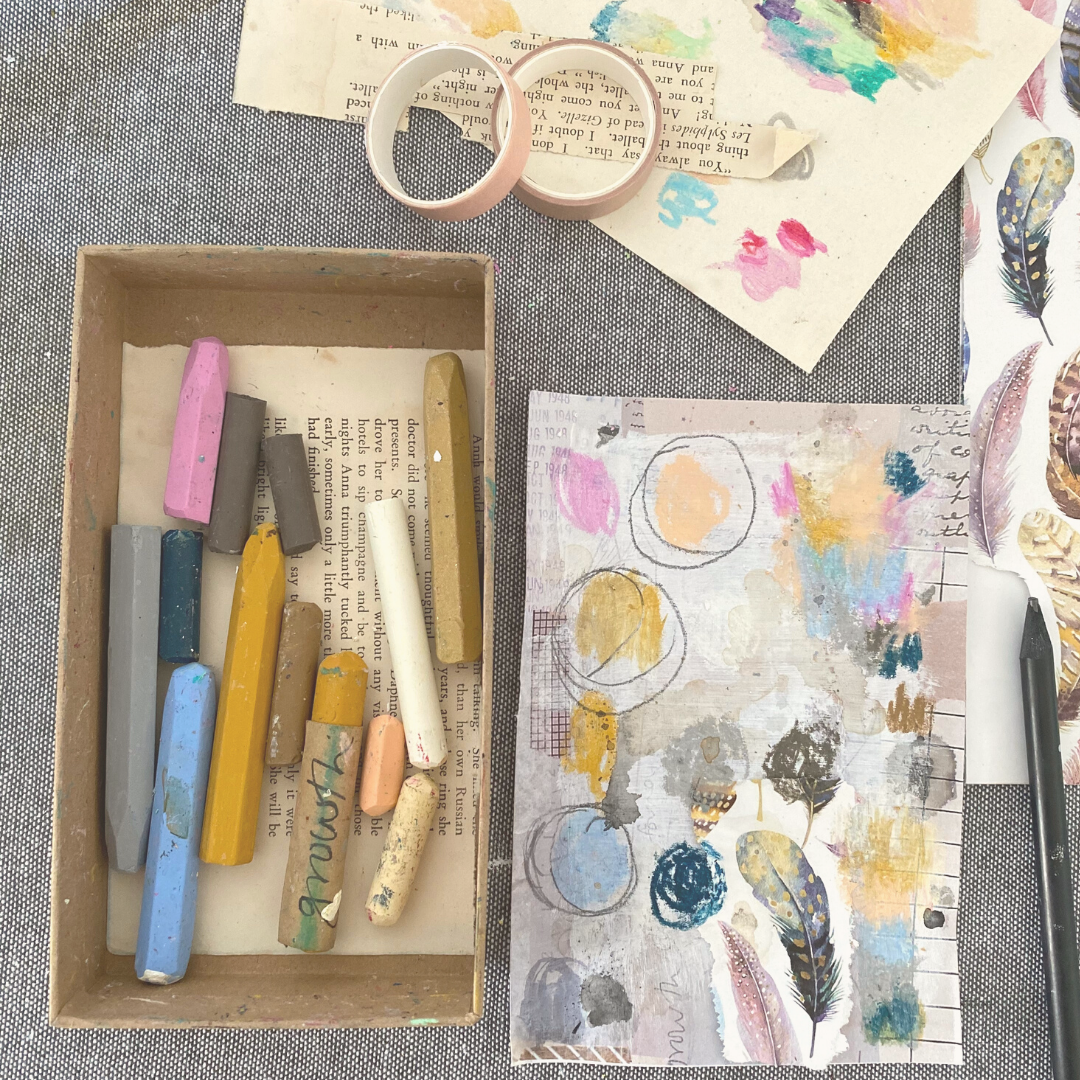
Once you’re happy you’ve captured your colours, it’s time to select just the right ones. I grab a new sheet of paper and scribble down or paint my chosen 5 - 7 colours and then I circle the 2 - 3 main ones.
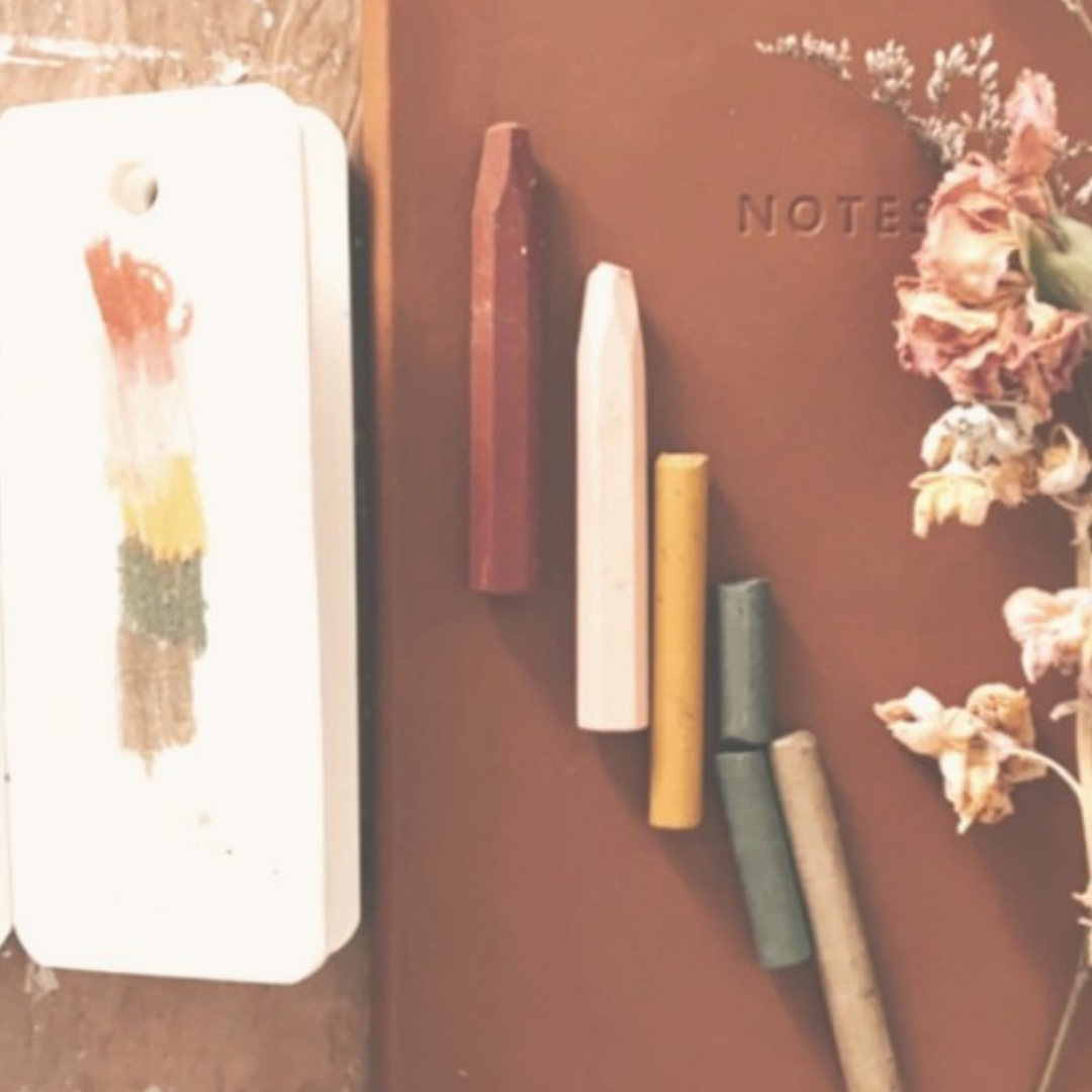
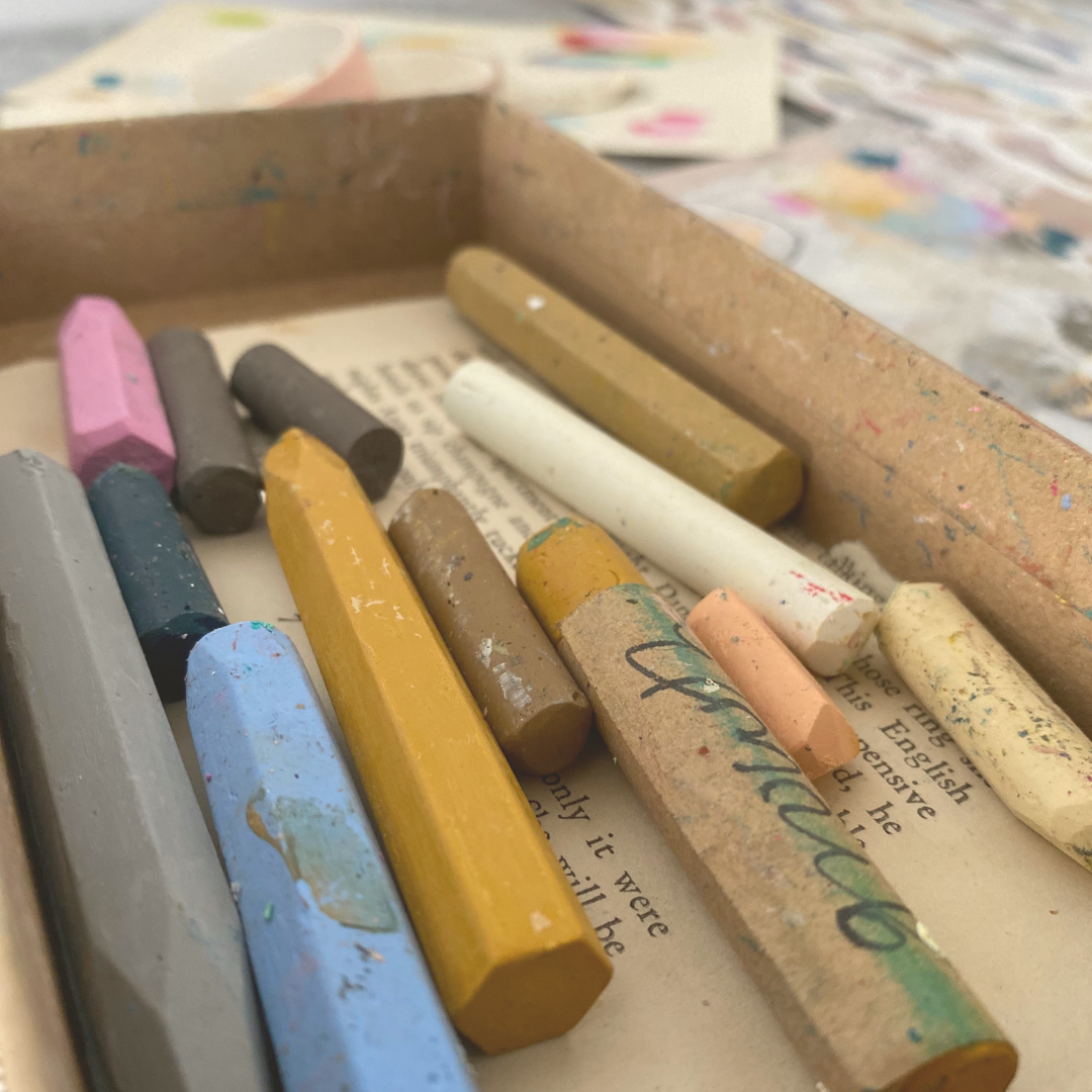
I stick this piece of paper up on my wall above my desk or tuck it into the front of my journal and reference it often while working in that particular journal. I also keep the paints and pastels used to create this palette to one side (in a separate box or tray), away from all the rest, for easy access and consistency,
Here is a visual step by step of this simple process:


pin for later


If you enjoyed this post you might also like: