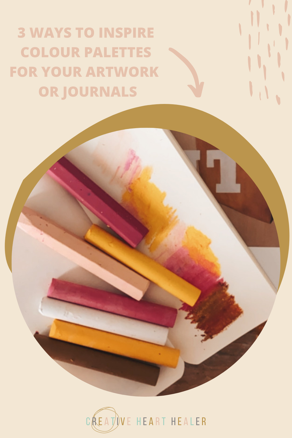
3 WAYS TO INSPIRE A COLOUR PALETTE FOR YOUR ARTWORK OR JOURNALS

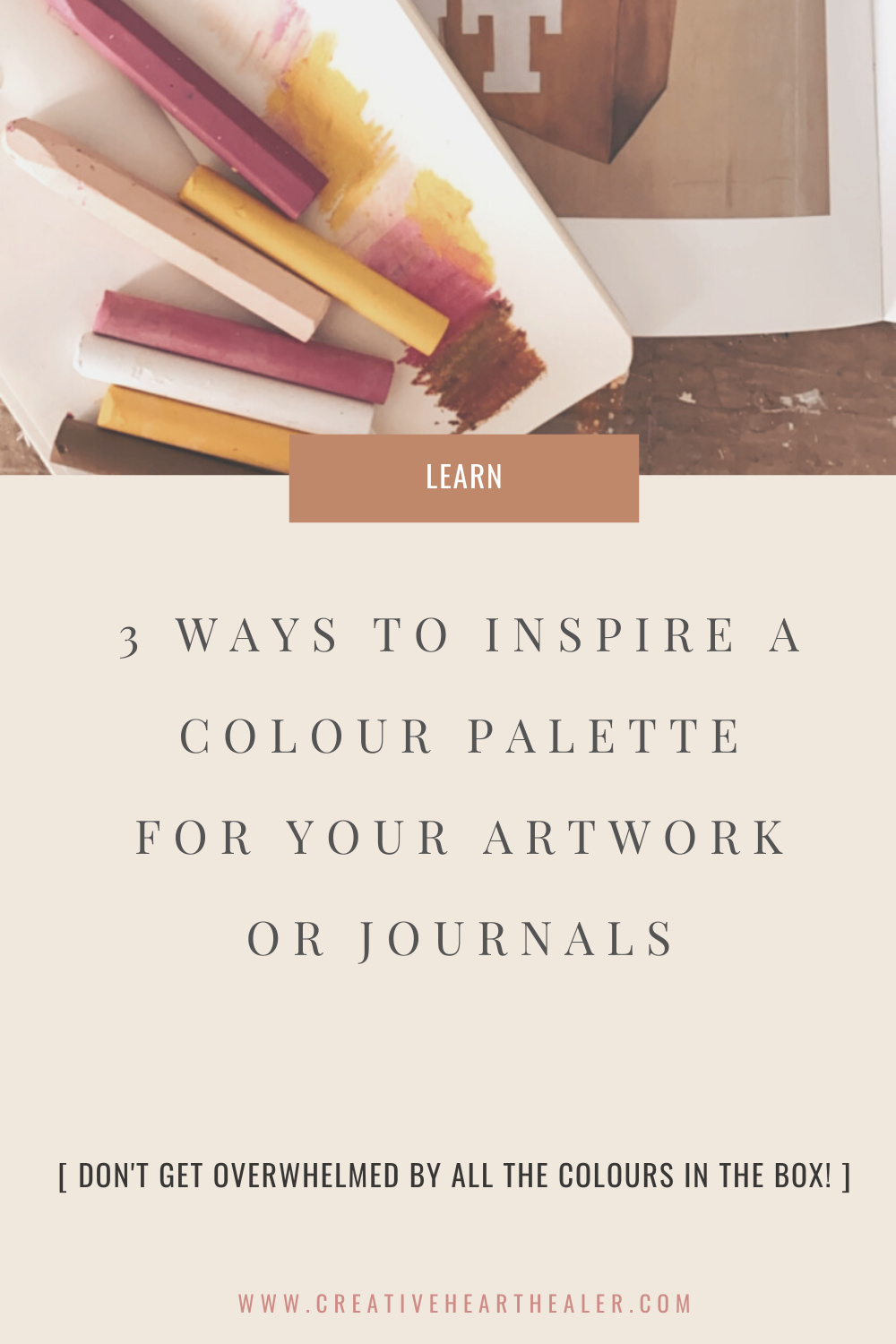
DO YOU GET OVERWHELMED BY ALL THE COLOURS IN THE BOX OR FRUSTRATED TRYING TO WORK OUT WHAT COLOURS LOOK GOOD TOGETHER?
LEARN HOW TO BUILD A COHESIVE COLOUR PALETTE IN UNDER 5 MINUTES WITH THESE 3 TIPS
TIP #1 - TAKE INSPIRATION FROM NATURE

Take a walk in nature with a focus on colour hunting. You will be amazed by how many beautiful colour palettes you find in the most unexpected places, from twigs laid upon moss, dying and dried up flowers, a feather trapped on a fence post.
To make a strong colour match try laying your pastels, pens or mixed paint right next to your inspiration piece.
TIP #2- TAKE INSPIRATION FROM OTHER ARTISTS

Pick up a book or search the internet for other artsists work that might inspire you, what is it about their colours that inspire you, take note of how many colours they use, the proportions of colour, how they lay one colour next to another and create contrast…choose a piece of artwork to use as a starting point for a colour palette of your own.
5-7 colours is the magic number when it comes to a cohesive colour palettes, you can of course add in shades of theses colours.
TIP #3 - TAKE INSPIRATION FROM MAGAZINE IMAGERY

Magazines are full of successful colour palettes, tear out pages and keep them in folder somewhere everytime a colour combo catches your eye. It could be landscape imagery, clothing colours, interiors and wallpaper…
Use a little notebook as a reference library to hold all your colour combinations you discover, you will want to refer back to this again and again! Just a few scribbles on a page will be enough to capture the palette.
pin for later